
Visualisation templates for Python
A selection of visualisation templates for you to build a visualisation more quickly.
16th July 2020, Yu Liang Weng
This article is updated regularly to keep up with latest Python data visualisation libraries, there are only limited number of templates here, for more examples please visit the following galleries/repositories:
- matplotlib
- seaborn
- plotly
- bokeh
- missingno - Missing data visualization module
- geoplotlib
- altair
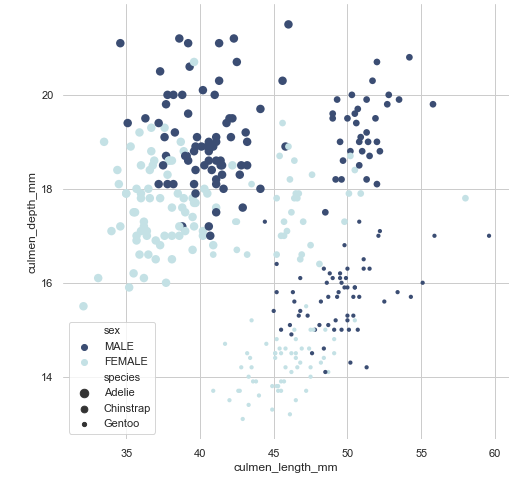
import seaborn as sns
import matplotlib.pyplot as plt
sns.set(style="whitegrid")

# Load the penguins dataset
penguins = sns.load_dataset("penguins")

# Set figure's size
f, ax = plt.subplots(figsize=(8, 8))

# Remove the left and bottom spines from plot
sns.despine(f, left=True, bottom=True)

# Plot
sns.scatterplot(x="culmen_length_mm", y="culmen_depth_mm",
                palette="ch:r=-.2,d=.3_r", hue="sex",
                size="species",
                linewidth=0,
                data=penguins, ax=ax)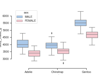
Boxplot
import seaborn as sns
sns.set(style="ticks", palette="pastel")

# Load the penguins dataset
penguins = sns.load_dataset("penguins")

# Plot body mass vs. specie types
sns.boxplot(x="species", y="body_mass_g",
            hue="sex", palette=["b", "pink"],
            data=penguins)
sns.despine(offset=10, trim=True)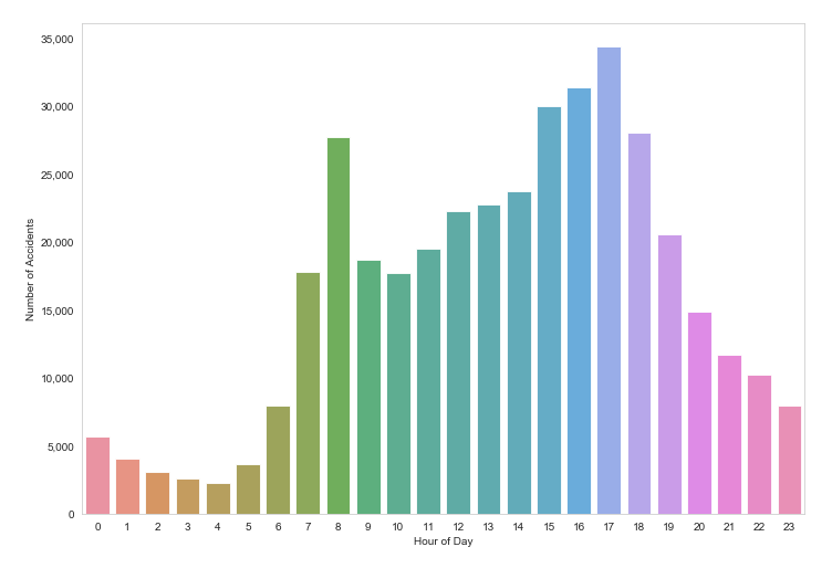
Barplot
import seaborn as sns

# Some data imported

df_time = df.Time.value_counts()
df_hour = df_time.groupby(df_time.index.hour).sum()
sns.barplot(df_hour.index, df_hour.values,
            alpha=0.86, palette="husl") \
    .get_yaxis().set_major_formatter(
        matplotlib.ticker.FuncFormatter(
          lambda x, p: format(int(x), ',')
        )
    )
plt.xlabel("Hour of Day")
plt.ylabel("Number of Accidents")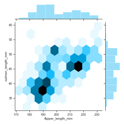
Hexbin plot
import numpy as np
import seaborn as sns
sns.set(style="ticks")

# Load the penguins dataset
penguins = sns.load_dataset("penguins")

sns.jointplot("flipper_length_mm", "culmen_length_mm",
              kind="hex", color="#00aeef", data=penguins)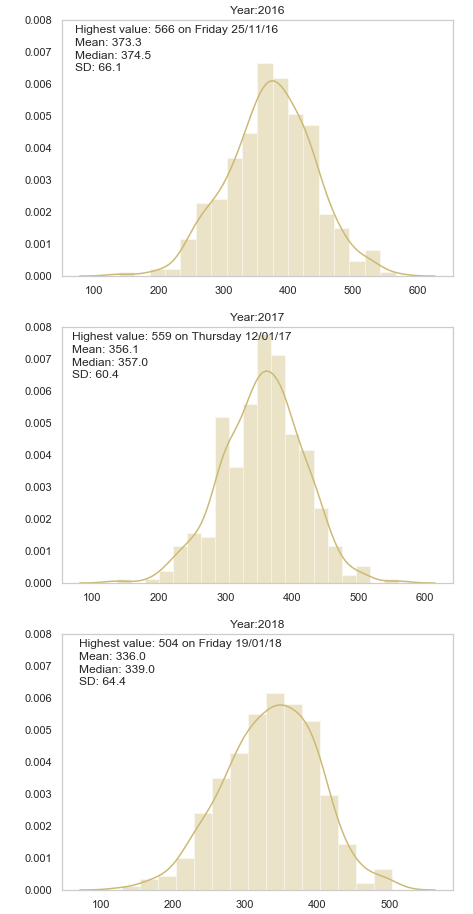
Distplot
import seaborn as sns

# import some data

fig, ax = plt.subplots(nrows=3, ncols=1, figsize=(7,16))
sns.set_color_codes()

# for each unique year
for i, col in enumerate(df["Year"].unique()):
    # count number of occurences of each date and sort by date
    df_year = df["Date"].loc[col == df["Year"]].value_counts()
    df_year_value = df_year.sort_values()[-1]
    df_year_index = df_year.sort_values() \
                      .index[-1].strftime("%A %d/%m/%y")

    ax[i].set_ylim([0.0,0.008])
    sns.distplot(df_year.values,  ax=ax[i], color="y")

    # set titles and label some text
    ax[i].title.set_text("Year:" + str(col))
    ax[i].text(70, 0.0076,'Highest value:'+ str( " {} on {} "
        .format( df_year_value, df_year_index )), fontsize=12)

    ax[i].text(70, 0.0072,'Mean:'+ str( "{: .{}f}"
        .format( df_year.mean(), 1 )), fontsize=12)

    ax[i].text(70, 0.0068,'Median:'+ str( "{: .{}f}"
        .format( df_year.median(), 1 )), fontsize=12)

    ax[i].text(70, 0.0064,'SD:'+ str( "{: .{}f}"
        .format( df_year.std(), 1 )), fontsize=12)

plt.show()