
Plots and analysis relating to the pandemic.

- Source
- Detail
- Code
- License
Angus, Colin (2020): CoVid Plots and Analysis. The University of Sheffield. Dataset. https://doi.org/10.15131/shef.data.12328226. GitHub repository.
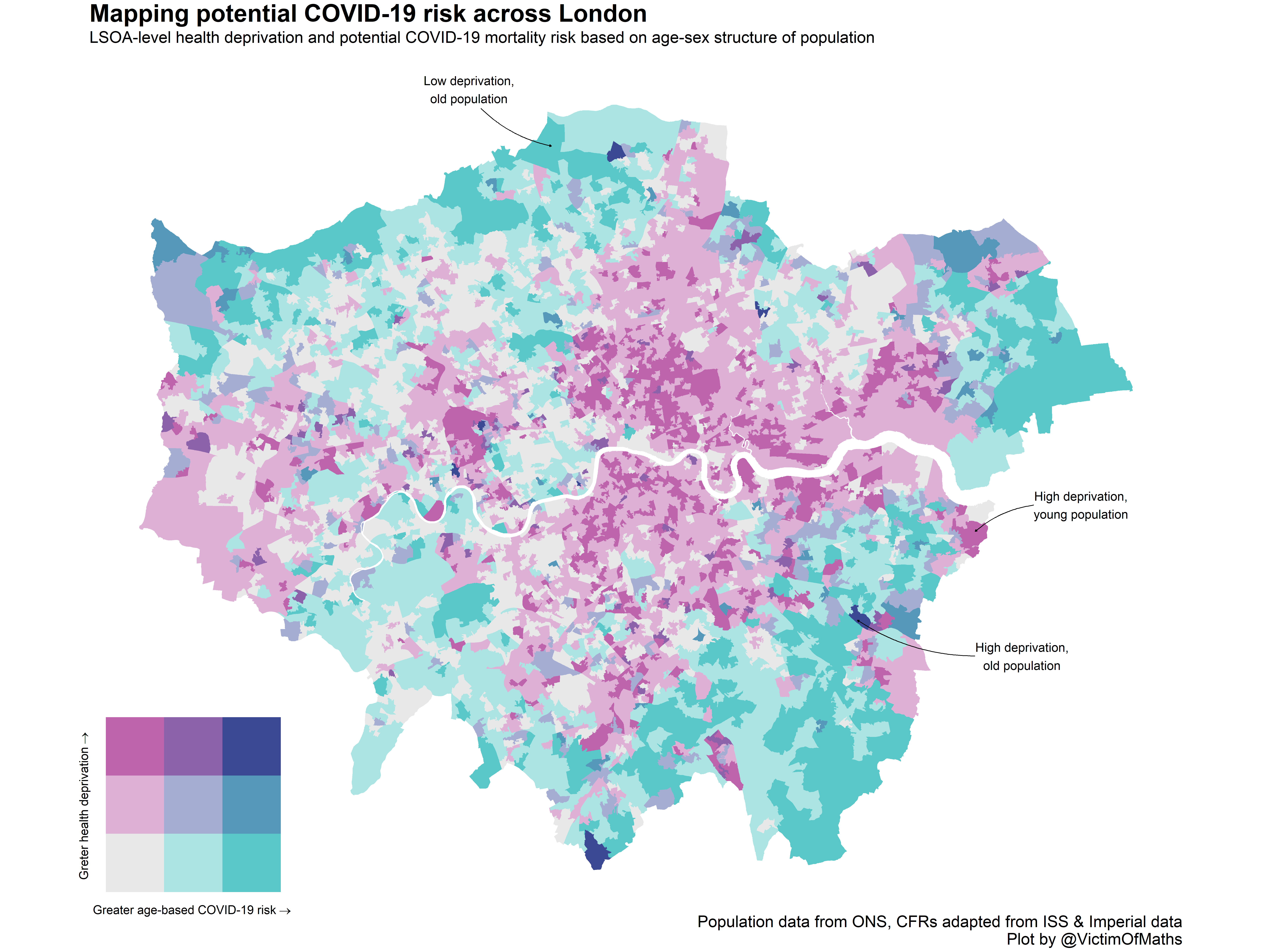
This visualisation brings together data on health deprivation and estimates of the potential COVID-19 mortality risk based on the age-sex structure of the population (following the approach developed by @ikashnitsky and @jm_aburto) at Lower Super Output Area level and plots bivariate maps highlighting areas with the greatest potential COVID-19 risk.
This visualisation is created using R, you can find source code here.
Anyone is free to use any of this code for any purpose (please make appropriate attribution to the author). Adapted from data from the Office for National Statistics licensed under the Open Government Licence v.3.0.