The last article introduced some basic descriptive statistics such as measures of central tendency and measures of variation. In this article, we will apply some measures to get a better understanding of selected datasets. Datasets we're using are Road Safety Data for accidents between 2016-2018, it can be download on data.gov.uk. You'll probably want to look at Variable lookup data guide on the website as well since some of the variables are coded and represented by numbers.
One of quickest way to use python and packages is to install Anaconda. Then go to Environments and change the dropdown menu from installed to all, search and install packages pandas, numpy and seaborn. Once you've done this, open either JupyterLab or Notebook at the home page and create a new ipynb file. Make sure datasets are placed in the same directory as the file.
import pandas as pd
import numpy as np
import matplotlib
import matplotlib.pyplot as plt
import seaborn as sns

sns.set_style("whitegrid", {'axes.grid' : False})
%matplotlib inline
plt.rcParams['figure.figsize'] = [11.7, 8.17]
Datasets were renamed to acc_2016.csv, acc_2017.csv, and acc_2018.csv. In here, we can concatenate them into one single dataframe.
years = [2016, 2017, 2018]
file_list = []
for year in years:
    df = pd.read_csv("acc_" + str(year) + ".csv", parse_dates=[9, 11])
    df["Year"] = year
    file_list.append(df)

df_acc = pd.concat(file_list)
df_acc.columns
The dataset has columns:
['AccidentIndex', 'Location_Easting_OSGR', 'Location_Northing_OSGR',
'Longitude', 'Latitude', 'Police_Force', 'Accident_Severity',
'Number_of_Vehicles', 'Number_of_Casualties', 'Date', 'Day_of_Week',
'Time', 'Local_Authority(District)', 'LocalAuthority(Highway)',
'1st_Road_Class', '1st_Road_Number', 'Road_Type', 'Speed_limit',
'Junction_Detail', 'Junction_Control', '2nd_Road_Class', '2nd_Road_Number',
'Pedestrian_Crossing-Human_Control', 'Pedestrian_Crossing-Physical_Facilities',
'Light_Conditions', 'Weather_Conditions', 'Road_Surface_Conditions',
'Special_Conditions_at_Site', 'Carriageway_Hazards', 'Urban_or_Rural_Area',
'Did_Police_Officer_Attend_Scene_of_Accident', 'LSOA_of_Accident_Location',
'Year'].
To see more details about the dataset, use df_acc and df_acc.dtypes.
If you look at dataset closely, you'll find some variables such as Weather_Conditions and Road_Type are coded in numbers; here, we transform numbers back to text according to Variable lookup data guide mentioned at the beginning. Backward slashes are used to indent code in new lines.
df_acc['Weather_Conditions'] = df_acc['Weather_Conditions'] \
    .map({1: "Fine no high winds", 2: "Raining no high winds", \
          3: "Snowing no high winds", 4: "Fine + high winds", \
          5: "Raining + high winds", 6: "Snowing + high winds", \
          7: "Fog or mist", 8: "Other", 9: "Unknown", \
          -1: "Data missing or out of range"})

df_acc['Road_Type'] = df_acc['Road_Type'] \
    .map({1: "Roundabout", 2: "One way street", 3: "Dual carriageway", \
          6: "Single carriageway", 7: "Slip road", 9: "Unknown", \
          12: "One way street/Slip road", -1: "Data missing or out of range"})
Start with time and date; we can use barplot to visualise the number of accidents by year, week, and day. From the plot below, we can see that the number of accidents decreases over three years period.
# count number of accident for each year, sort by year, make index a new column
df_byYear = pd.DataFrame(df_acc.Year.value_counts().sort_index()).reset_index()
df_byYear.columns = ["Year", "Number of accidents"]

# plot, add seperator for thousands, add title
plot = sns.barplot(x="Year", y="Number of accidents", palette="rocket", data=df_byYear)
plot.get_yaxis()
    .set_major_formatter(matplotlib.ticker.FuncFormatter(lambda x, p: format(int(x), ',')))
plot.set_title("Number of accidents for each year 2016-2018")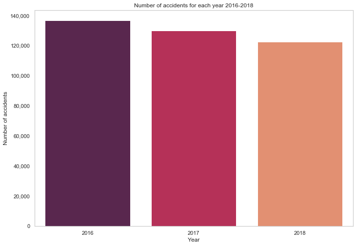
The distribution of accidents by day of the week looks a bit more interesting - more accidents occurred on days at the end of the week, closer to the weekend. Typically working days have a higher number of accidents, and over a sixth of overall accidents occurred on Friday.
# calculate proportion of accidents for each day of the week.
Week_Days = df_acc["Day_of_Week"].value_counts().sort_index()/len(df_acc)*100
Week_Days.index = ["Sun", "Mon", "Tue", "Wed", "Thu", "Fri", "Sat"]
sns.barplot(Week_Days.index, Week_Days.values, alpha=0.8, color="black")
plt.title("Distribution of Accidents by Day of the Week")
for i, val in enumerate(Week_Days.values):
    plt.text(i-0.1, val-1,  str( "{:.{}f}".format( val, 1 )), color='white', fontweight='bold')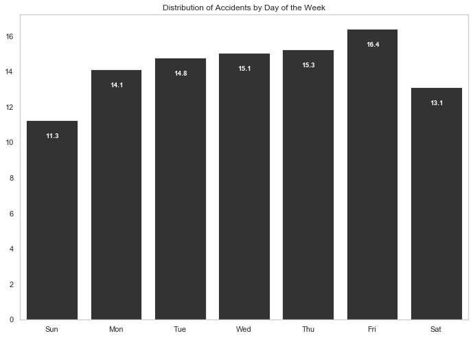
Most accidents occurred during typical commuter times.
acc_by_time = df_acc.Time.value_counts()
acc_by_hour = acc_by_time.groupby(acc_by_time.index.hour).sum()
sns.barplot(acc_by_hour.index, acc_by_hour.values, alpha=0.86, palette="husl") \
    .get_yaxis()
    .set_major_formatter(matplotlib.ticker.FuncFormatter(lambda x, p: format(int(x), ',')))
plt.xlabel("Hour of Day")
plt.ylabel("Number of Accidents")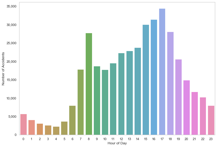
What if we sort it by hour?
acc_by_hour_sorted = acc_by_hour.sort_values()
sns.barplot(acc_by_hour_sorted.index, acc_by_hour_sorted.values, order=acc_by_hour_sorted.index , alpha=0.86, palette="husl") \
    .get_yaxis().set_major_formatter(matplotlib.ticker.FuncFormatter(lambda x, p: format(int(x), ',')))
plt.xlabel("Hour of Day")
plt.ylabel("Number of Accidents")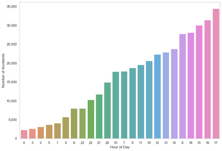
Now we look at density distributions to see the average, median and standard deviation of the number of accidents for each year. The plot also includes the day on which the highest number of accidents occurred (mostly on Friday).
fig, ax = plt.subplots(nrows=1, ncols=3, figsize=(16,7))
sns.set_color_codes()

for i, col in enumerate(df_acc["Year"].unique()):

    acc_per_year = df_acc["Date"].loc[col == df_acc["Year"]].value_counts()
    acc_per_year_value = acc_per_year.sort_values()[-1]
    acc_per_year_index = acc_per_year.sort_values().index[-1].strftime("%A %d/%m/%y")

    ax[i].set_ylim([0.0,0.008])
    sns.distplot(acc_per_year.values,  ax=ax[i], color="y")
    ax[i].title.set_text("Year:" + str(col))
    ax[i].text(70, 0.0076,'Highest value:'+ str( " {} on {} ".format( acc_per_year_value, acc_per_year_index )), fontsize=12)
    ax[i].text(70, 0.0072,'Mean:'+ str( "{: .{}f}".format( acc_per_year.mean(), 1 )), fontsize=12)
    ax[i].text(70, 0.0068,'Median:'+ str( "{: .{}f}".format( acc_per_year.median(), 1 )), fontsize=12)
    ax[i].text(70, 0.0064,'SD:'+ str( "{: .{}f}".format( acc_per_year.std(), 1 )), fontsize=12)

plt.show()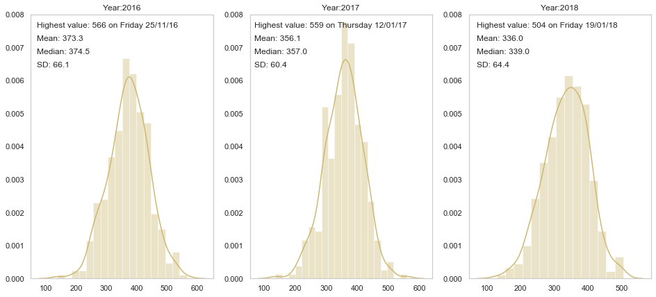
We can also use a boxplot to illustrate the outliers, minimum, maximum, median and quartiles.
sns.set(style="whitegrid")
df_box = []
for i, col in enumerate(df_acc["Year"].unique()):

    acc_per_year = pd.DataFrame(df_acc["Date"].loc[col == df_acc["Year"]].value_counts().reset_index())
    acc_per_year.columns = ["Date", "Count"]
    acc_per_year["Year"] = col
    df_box.append(acc_per_year)

box_data = pd.concat(df_box)
sns.boxplot(x="Year", y="Count", data=box_data)
plt.title("Box plots - a different representation for distribution of number of accidents occured each year")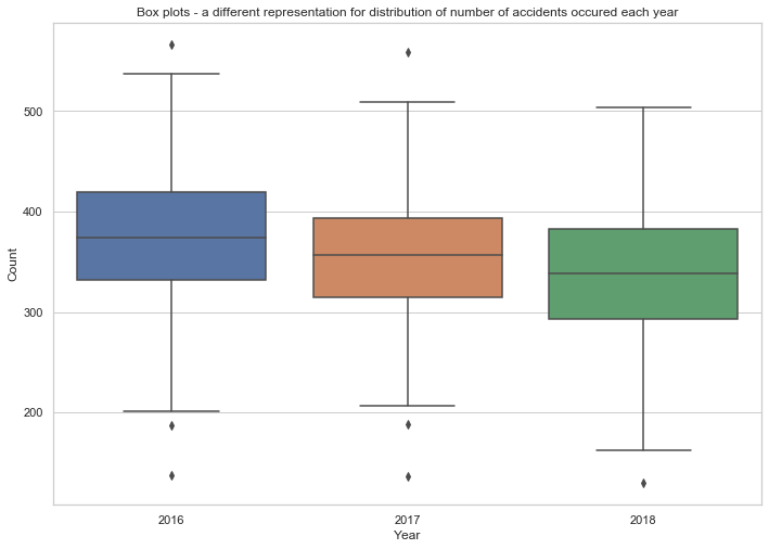
Now we look at some categorical variables such as Weather_Conditions, Road_Type and Accident_Severity.
Count the number of accidents under each weather condition.
sns.set_style("whitegrid", {'axes.grid' : False})
df_wc = df_acc.Weather_Conditions.value_counts()
df_wc[0]/len(df_acc)*10081.22845148726486Fine no high winds condition appeared in over 80% of all accidents; what about other conditions?
df_wc = df_wc.drop("Fine no high winds")
plot_wc = sns.barplot(df_wc.index, df_wc.values)
plt.xlabel("Weather Conditions")
plt.ylabel("Number of Accidents")
plot_wc.set_xticklabels(plot_wc.get_xticklabels(), rotation=30)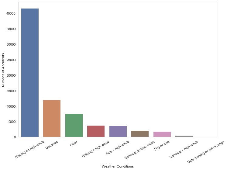
Let's do the same for road types.
df_rt = df_acc.Road_Type.value_counts()
plot_rt = sns.barplot(df_rt.index, df_rt.values, palette="husl")
plt.xlabel("Road Type")
plt.ylabel("Number of Accidents")
plot_rt.set_xticklabels(plot_rt.get_xticklabels(), rotation=30)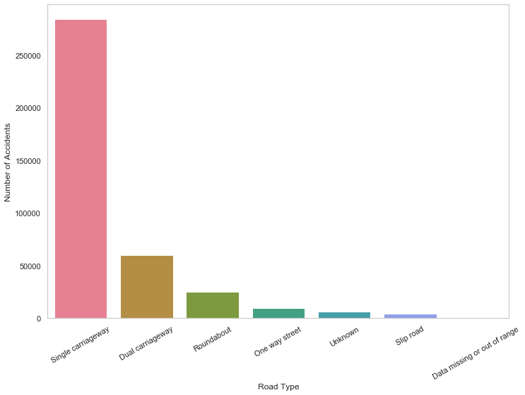
Based on Road_Type, let's find out about accident severity for each road.
acc_sev = { 1: "Fatal", 2: "Serious", 3: "Slight" }
category_colors = plt.get_cmap('PiYG')(np.linspace(0.7, 0.9, 3))

for i in range(1, 4):
    df_rt_sev = df_acc["Road_Type"].loc[df_acc["Accident_Severity"]==i].value_counts()
    df_rt_sev = (df_rt_sev/df_rt_sev.sum())*100
    plt.barh(df_rt_sev.index.astype(str), df_rt_sev.values, alpha=0.40, label=acc_sev[i], color=category_colors[(i-1)])

plt.legend()
plt.show()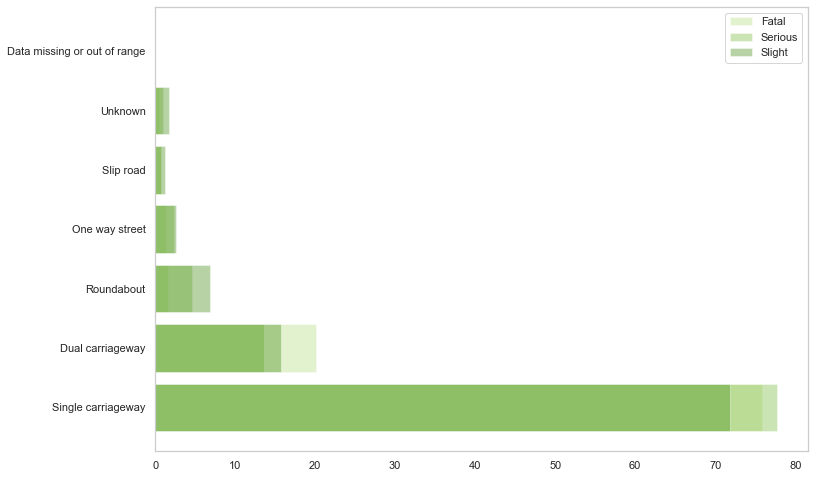
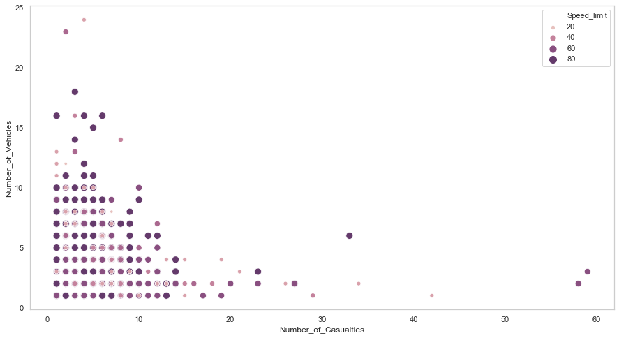
cmap = sns.cubehelix_palette(dark=.3, light=.8, as_cmap=True)
plt.figure(figsize=(15,8))
data = df_acc[df_acc["Year"] == 2018]
sns.scatterplot(y="Number_of_Vehicles", x="Number_of_Casualties", hue="Speed_limit", \
                data=df_acc, size="Speed_limit", sizes=(20, 100), palette=cmap)