
Data Visualization’s Social Role

Helen Kennedy
09 September 2020 · 7 min read
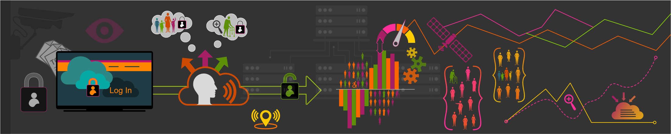
 Image from Living With Data
I have been researching the social role of data visualizations since 2013. I was working on a research project exploring how resource-poor public sector organisations were engaging with social media data, when I was struck by the visceral ways in which collaborators responded to visual representations of said data. Without taking the time to make sense of the data visualizations included in a report that the research team produced, one collaborator told us that he loved them, and he wanted more. This set me off on a path researching how people engage with data visualizations, the role that emotions in these engagements, and the consequences, or effects, of engaging with data visualizations.
 Common chart types, from Seeing Data
 My first project was Seeing Data, which ran from 2014 to 2015 and was funded by the AHRC. Working with Visualising Data and the Migration Observatory at the University of Oxford, on Seeing Data, we explored how people make sense of data visualizations. We found that a range of factors affect engagements with data visualizations, including subject matter, source/original location, beliefs and opinions, time, emotions, confidence and skills. We concluded that as a result of what we found, more comprehensive definitions of what constitutes effectiveness were needed in relation to datavis (Kennedy et al 2016). We were struck by the important role than emotions play in people’s engagements with datavis – this was noteworthy, we thought, because data are often assumed to be scientific and objective and so require reasoning to make sense of them (Kennedy and Hill 2018). In fact, most people encounter data in visual form, and this stirs up emotions.
The work we started on Seeing Data is continued by three excellent PhD students on an ESRC PhD Network called Relating to Data through Visualization. Jill Simpson is researching the meaning-making processes at work when people interpret dataviz. Lulu Pinney is researching data visualization literacy. And last but not least, Arron Ridley is exploring approaches to dataviz evaluation that capture the diversity of populations.
From 2016 to 2019, I participated on a project funded by the Norwegian Research Council called INDVIL, or Innovative Data Visualization and Visual Numeric Literacy, which explored data visualization as a semiotic, aesthetic and discursive resource in society. A major output from INDVIL is Data Visualization In Society, a collection I co-edited with Martin Engebretsen, with chapters from the INDVIL team and many others. This book is open access (from Amsterdam University Press) and as such is a great resource for folks teaching about dataviz in society.
From October 2020, I will be working on a project called Generic Visuals in The News: the role of stock photos and simple data visualizations in assembling publics, with collaborators from the University of Leeds. Funded by the AHRC, Generic Visuals investigates the role that everyday images in the news play in bringing publics together, building the public sphere and in facilitating democratic processes. On this project, we will compare simple data visualizations with stock photos. We call these images ‘generic visuals’, because they have standardized formats and appearances and perform particular design functions, and in order to engage with research that has emphasized the increasing importance of generic-ness in journalism aesthetics.
Visual imagery permeates the news: journalism and other forms of digital information dissemination are visual. In the limited research which acknowledges the significance of visuals in the news, analyses prioritise arresting, individualized and iconic images and how they activate citizens to care or not care about particular issues. Recent studies of increasingly ubiquitous data visualizations in the news have likewise focused on those that are award-winning or considered beautiful. Yet what we call ‘generic visuals’ populate journalism and other information sources today, off and online, across mobile apps and other digital platforms. Given their ubiquity, it is vital that we understand the roles that these generic visual forms play in assembling publics. Our overarching aim, therefore, is to develop understanding of the role that generic visuals play in assembling publics, in building the public sphere(s) and in facilitating democratic processes. Watch this space for more about our project in the coming years.
References
Kennedy, H., Hill, R. L., Allen, W. and Kirk, A. (2016) “Engaging with (big) data visualizations: Factors that affect engagement and resulting new definitions of effectiveness”, First Monday, 21(11). doi: 10.5210/fm.v21i11.6389.
Kennedy, H. and Hill, R. L. (2018) ‘The Feeling of Numbers: Emotions in Everyday Engagements with Data and Their Visualisation’, Sociology, 52(4), pp. 830–848. doi: 10.1177/0038038516674675.

Professor of Digital Society
Director of the Digital Society Network
The University of Sheffield
Helen Kennedy is Professor of Digital Society at the University of Sheffield. Over 20+ years, she has researched how digital developments are experienced by 'ordinary people' and how these experiences can inform the work of digital media practitioners. She is currently interested in the datafication of everyday life. She is researching public attitudes to data mining and related issues such as trust in data, data and inequality and what 'good' data practice might look like. She is also interested in the role of visual representations of data in everyday life.