
Microsoft Excel Best Practices

Yu Liang Weng
30 September 2020 · 11 min read
Microsoft Excel is a well-known spreadsheet developed by Microsoft for platforms like Windows, macOS, and various mobile operating systems. Excel has been the industry standards for spreadsheet since 1993 and commonly used for calculations, creating graphs and charts, and pivoting tables. Microsoft built Visual Basic for Application (also known as VBA, derived from the programming language Visual Basic) into Excel that allows you to write scripts that automates repeated tasks, this script often called a macro - a series of instructions. Excel is easy to use with graphics interface and useful documentations/hints, and the graphical representation of data and built-in mathematical formulas makes calculations straight-forward and simple. Additionly, Excel has substantial number of graphs and charts under the hood so that you can create some visualisations in minutes, providing you have the right data structure for chosen charts.
Note: All graphs/charts below are created using Excel 2016.
What steps could we take to make better data visualisations with excel?
No matter what kind of tools you want to use, there are some questions you need to ask yourself before creating visualisations.
Once we have answered each of the questions above, what specific actions could we take when making data visualisation in Excel?
To cook a dish you will allocate a substantial amount of time in the preparation of ingredients, whether you need to clean, rinse, slice, curing, freeze, decoat… Typically, the more time you spend in taking care of ingredients, the more flavour you get out of it. In making a visualisation you will also need to spend some time in preparation of the data. The table below listed some of common things you might want to take into account:
| Item | Description |
|---|---|
| Data types | There are over ten different data types available (Microsoft are expanding this to more than 100!) and Excel will interpret each type differently. Having a suitable data type for each column help to maintain the consistence of column values and help you to avoid unsuitable graphs. |
| Order of sheets | It is common that you might have more than one spreadsheet in an Excel file, therefore, by ordering spreadsheets in a way that matches the order in your process could help you locate information more easily and will also be beneficial to your collarators. |
| Missing values | Missing values could have a significant effect on your outputs, it typically occurs when a cell doesn't have a value (when it is required) or the value is represented by NA, NaN, Null etc. Generally, you can impute missing values by column average, median, most frequent value, and k-nearest neighbourhood (k-NN). However, missing value itself is a broad topic and there are different resolutions depending on the value's data type, the relationship between data rows, and potentially other hidden issues. |
| Clarity | Check that your spreadsheet is easy to read and understand, for example, don't use complicated or irrelevant column names. |
| Merge cells | Avoid merge cells if you can as this could discard some value and cause inconsistencies. |
| Sorting | Excel does not perform sorting for you when creating graphs/charts, so watch out for your column values if you need to present values in certain order. |
| Macros | Considering using macro if you need to perform some repeated tasks. |
| Conditional formatting | Use of conditional formatting could help you to identify trends and patterns within your spreadsheets by changing the visual appearance of cells. |
| Data validation | Data validation is a feature in Excel that validates users input for a cell. Use of data validation could help you avoid inconsistent data values. |
| Protection | If you're collarate with other people and do not wish them to change certain cells, you can add protection to the spreadsheet by lock cells up. If your data comes from an external database then prefer connection to DB to ensure integrity rather than copy data out of DB. |
You might have already noticed that Excel has a convenient built-in feature called Recommended Charts in the Insert section, as the name suggests it analyse and recommends charts to you based on the cells you have selected. If you want to make your own decision or wish to learn how to choose correct charts, check out the following resources:
After you have made your mind of which chart to use, it doesn't necessarily mean that you are done and can walk away with this visualisation. There are some details you have to watch out:
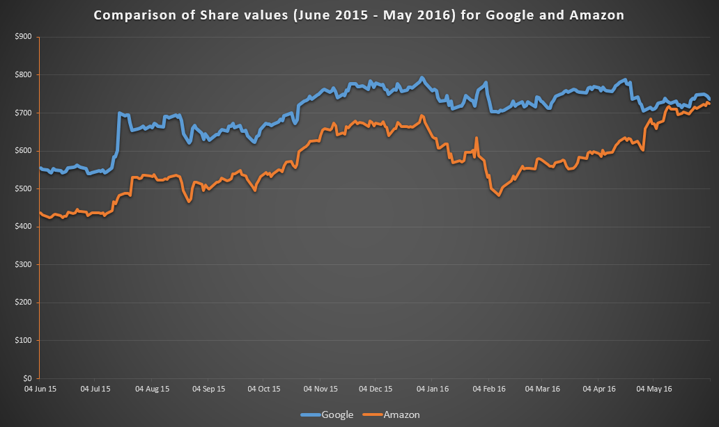
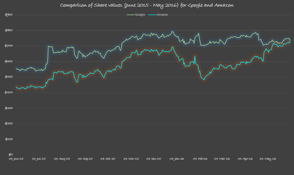
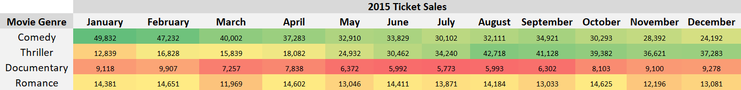
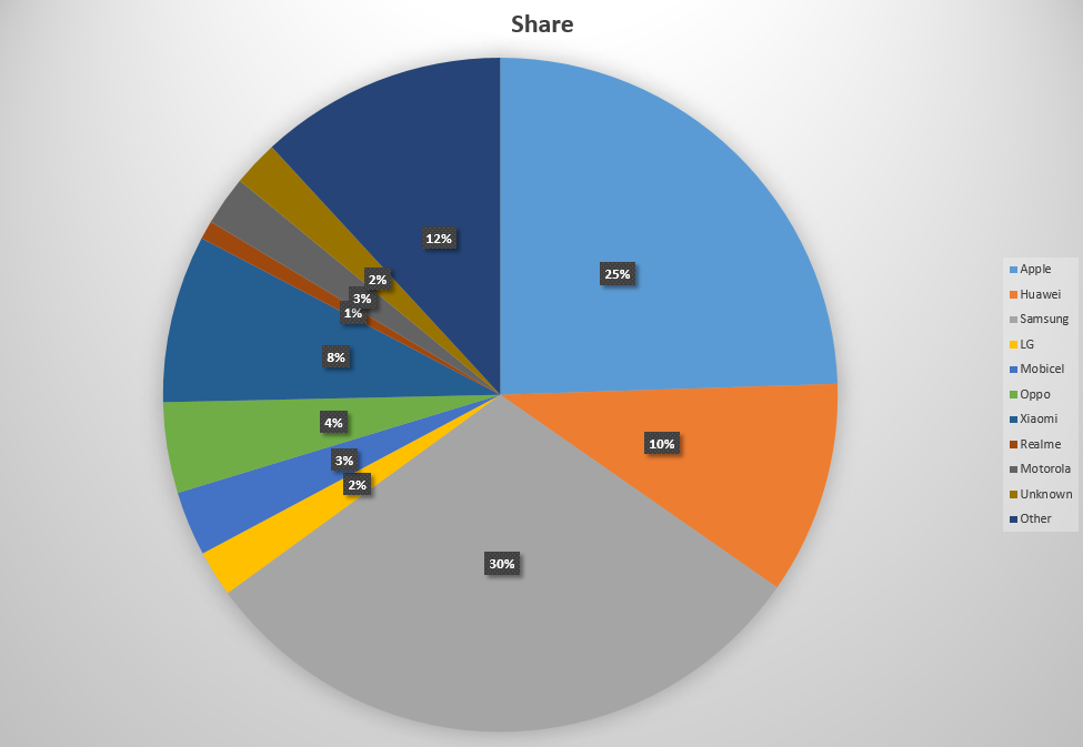
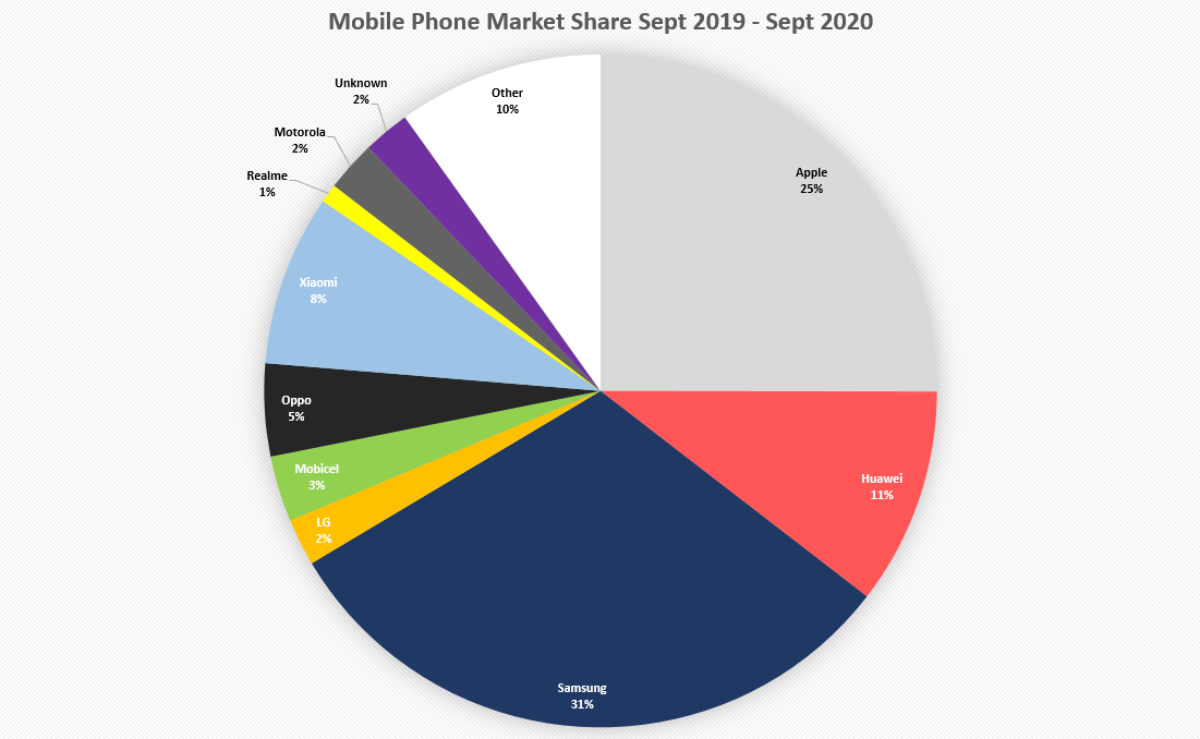
Here is a comparison between a good and a bad example of using different styles and themes.
Good:
Not so good:
- Numerical axis should start from 0
- Every chart should have a clear and relevant title (descriptive title)
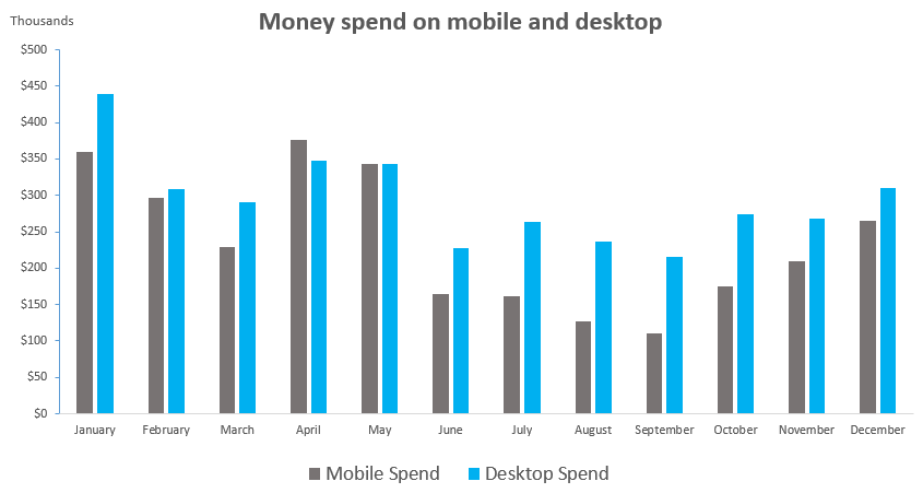
- Change the unit of axis if text becomes cluttered, e.g. add thousands separate or convert to thousands, millions
- Avoid tilted axis labels, try a different chart or widen the chart if labels are too long
- Use data labels over gridlines
- Remove unnecessary axes would help you keep visualisation clean
- Consistent intervals!
- Avoid acronyms unless you have stated elsewhere
- Avoid distract background and gridlines in most of cases
- Delete legend if less than two metrics
- Prefer labels over legend for pie charts
- Avoid tilted axis labels
- Does the number of a pie chart add up to 100%?
- If there are only few varaibles on the x-axis, data labels might be better than axes
Tell a story, only highlight what you think is importantThis section listed some things that you might want to consider before you put it in production:
3D - Excel offers a 3-dimensional version for most of the charts, however, it is rare that people don't find it confusing and difficult to interpret.
Dots - When producing a line graph or a time series graph you often see graphs with dots at each time point, most of the time these dots don't add any extra value.
Complex background - Unsuitable background can be distracted and conflicting with your text and colours.
Cropped axis - cropped axis can cause confusion and misleading because not all information is visible to audiences.
Colours - When you have multiple lines in your graphs, is it worth to use different colour for each line or only colour the important one to make it stand out?
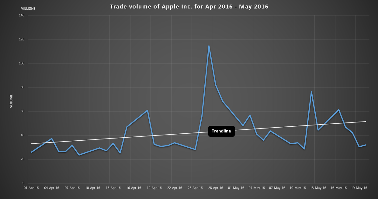
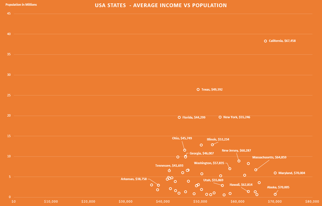
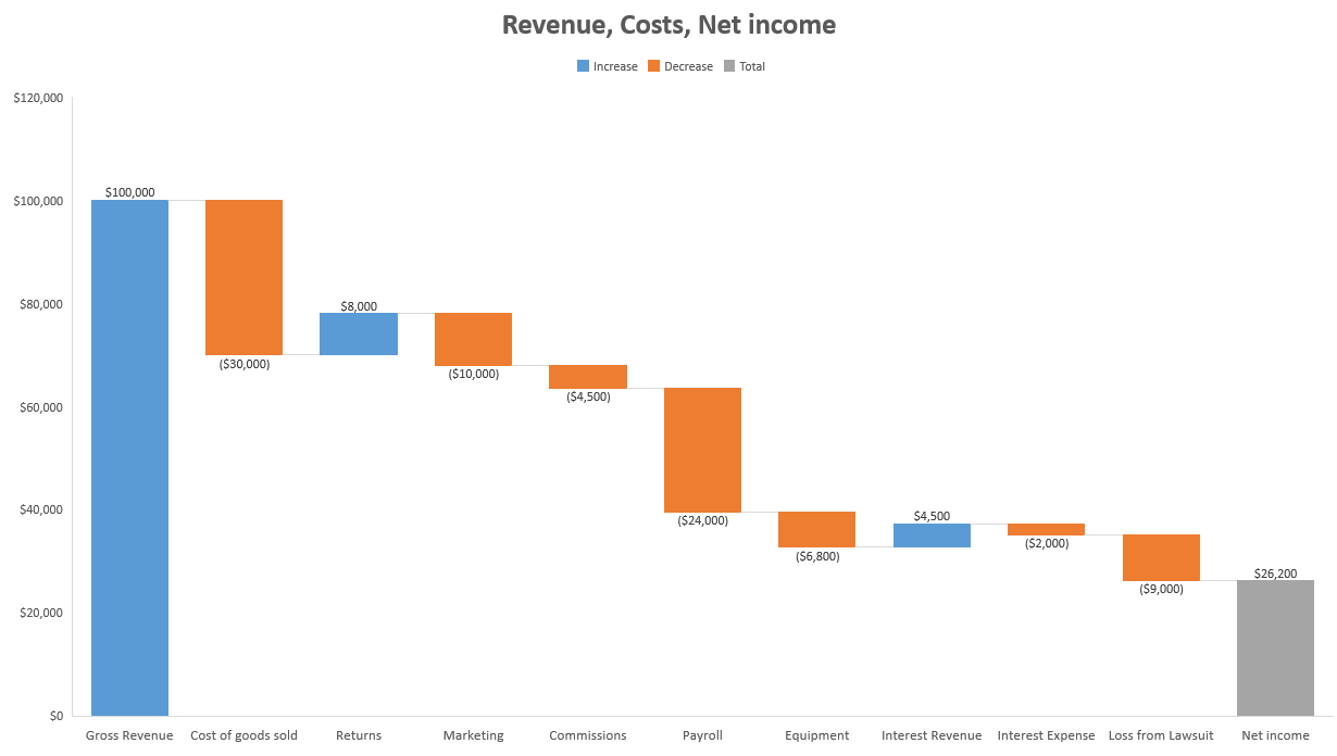
This section presents some (good and bad) example charts made from Microsoft Excel 2016. Click on images to enlarge. You can download data used for these examples from the Linkedin course Excel Data visualisation.
Left axis is removed and replaced by labels.
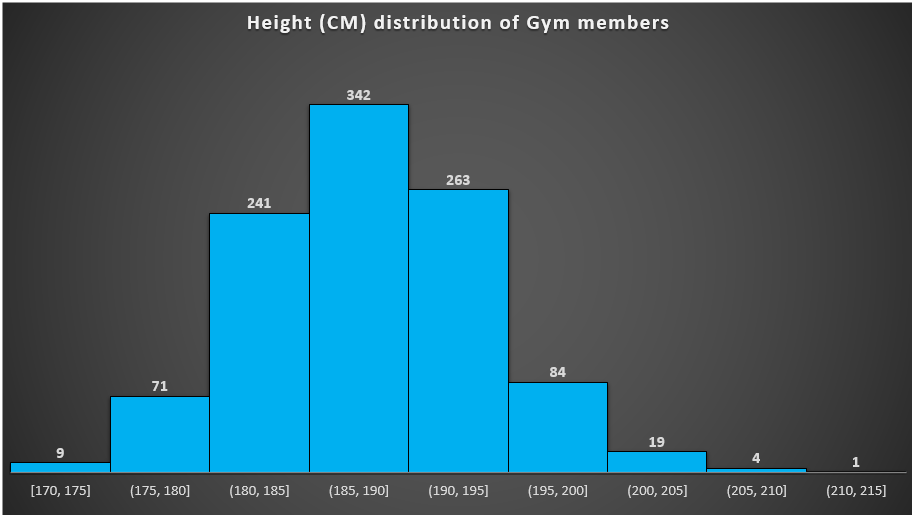
If your aim is to find the number of gym members with height in the range 180 - 185cm, highlight it should make some difference.
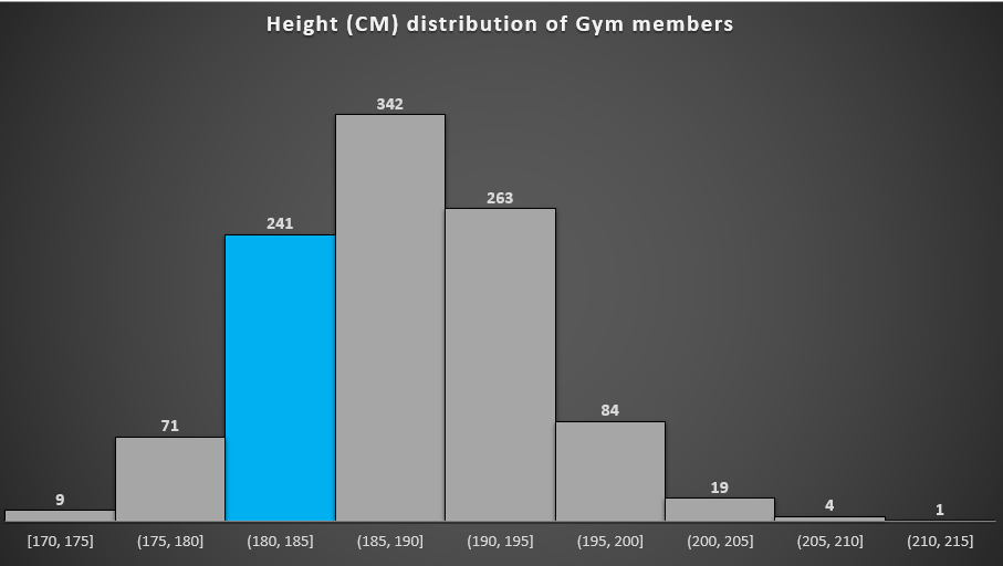
With numbers removed:

Labels or legends?
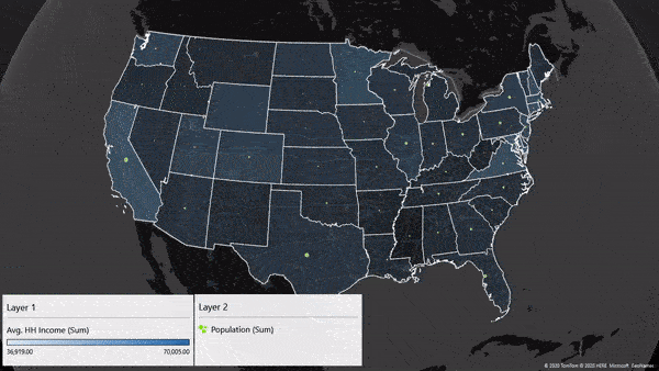
A 3D map tour created using Excel:
If you wish to explore more about Excel, it is worth to check the following resources:
If you think about moving from Excel to Python or R, get started on our Learning Path.