
Interactive Visualisations in R

Yu Liang Weng
27 January 2021 · 10 min read
Welcome to the third blog post of the series Exploring packages in R. In this blog post we will explore some of the most popular packages in R for Interactive Visualisations and some of which you might have already noticed. Same as in the previous blog post, I will be using the Hadfield Green Roof 5-year dataset and assume you already have some experience with R.
You can find all the source code in this Github repository. If you have any suggestions or want me to include any particular package feel free to send me an email!
In the first two sections we will explore Plotly and Shiny which are among the most downloaded visualisation packages, and then followed by other interactive packages in later sections.
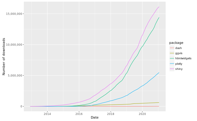 Download statistics of visualisation packages up to 21 Jan 2021 (source: R pkg download stats)
You might wonder what htmlwidgets is - "A framework for creating HTML widgets that render in various contexts including the R console, 'R Markdown' documents, and 'Shiny' web applications." In fact, any interactive visualisations produced that can be saved as a standalone HTML file via the htmlwidgets::saveWidget() function, including packages like plotly, leaflet, and ggiraph that we are going to learn about.
Plotly was known for providing scientific charting libraries that has been increasingly popular over the last few years and you can discover its place in many popular programming languages and platforms such as Python, R, Javascript, Angular, React.JS, and .NET.
The plotly package in R was created as an interface to the Javascript Library plotly.js therefore you can create many interactive web-based graphics out of it. Since the package also depends on the ggplot2 package we have explored in the previous blog post, we can actually interact with the charts and graphs we have made by using the ggplotly() function that converts a ggplot2 object into a plotly object!
To see examples of open-source graphics made with the R plotly package, use this link. These examples are appended with read-to-run code blocks that will help you get started very quickly. In addition, if you are looking for a particular graph, most of the sections contain a 'More...' link that leads to a range of extra visualisations. For extensive documentation of the package take a look at the PDF from CRAN.
If you have made some wonderful charts using ggplot2 then rather than starting from scratch in plotly we can instantly convert it to a plotly object and work with it directly.
Using the bar chart in the previous blog post as an example, we can first assign the graph to an variable before using the ggplotly() function for conversion:
plot1 <- shefClimateNoNA %>% ... # skip rest of codes
ggplotly(plot1, tooltip = c("x", "AirTC_Avg"))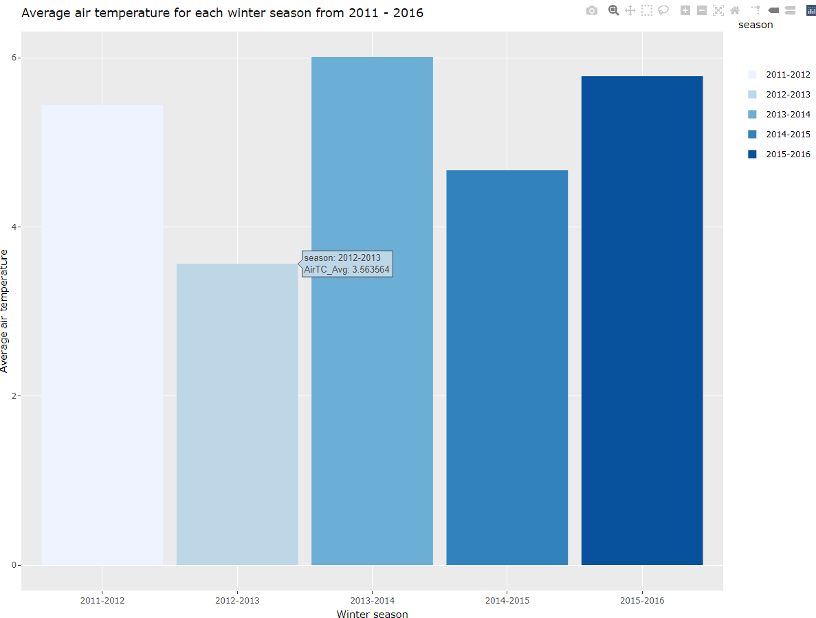 Screenshot of the interactive bar chart
If you want to play with the interactive version of this bar chart, right click this link to save the standalone HTML file to your device and open it with your favourite browser.
Now let's use the heatmap as an example to visualise the daily average temperature for the period from 1 Jan 2015 to 31 Dec 2015. First we need to tidy and transform data in few steps:
- Filter dates we do not want
- Add two columns month and day from TIMESTAMP and drop all other columns except air temperature
- Group data by day and compute the average temperature over 24 hours
- Transform the data frame so that we have monthly calendar with temperatures on seperate rows
- Drop the month column and convert the data frame into matrix
shefClimateHeatmap <- shefClimateNoNA %>%
  filter(
    between(TIMESTAMP, as.POSIXct("2015-01-01"), as.POSIXct("2016-01-01"))
  ) %>%
  mutate(
    month = month(TIMESTAMP, label = TRUE),
    day = day(TIMESTAMP)
  ) %>%
  select(AirTC_Avg, month, day) %>%
  group_by(month, day) %>%
  summarise(AirTC_Avg = mean(AirTC_Avg)) %>%
  pivot_wider(names_from = day, values_from = AirTC_Avg) %>%
  ungroup() %>%
  select(-c(month)) %>%
  as.matrix()
Now we can create our heatmap with transformed data:
myHeatmap <- plot_ly(
  x = sprintf("%d", 1:31),
  y = month.abb[1:12],
  z = shefClimateHeatmap,
  type = "heatmap"
)
Add some customisation for the title and hover texts:
myHeatmap %>%
layout(
title = "Daily average temperature in Sheffield (2015)"
) %>%
add_trace(
showscale = FALSE,
hovertemplate = paste(
'<b>Date</b>: %{x} %{y}',
'<br><b>Temperature</b>: %{z:.2f} C',
'<extra></extra>' # add EXTRA tag to hide trace name
)
)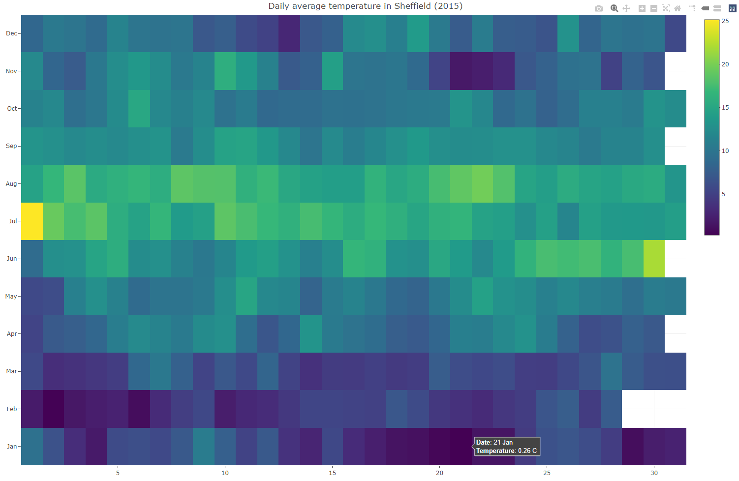 Daily average temperature in Sheffield (2015)
Standalone HTML file for the heatmap.
Dash is a framework that was firstly built in Python for building interactive web applications, and Dash for R was first announced in July 2019. Dash is designed to suit any programming languages with 80% of it being Javascript and API design. If you have used Dash in Python then it is just a matter of changing the interface to call the API, this strong foundation makes Dash a good alternative to Shiny that will be introduced in the next section.
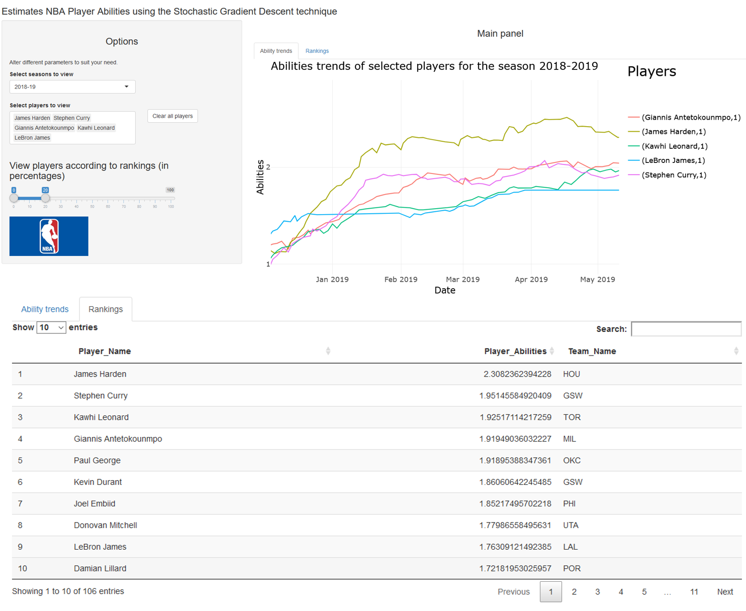
You can also visit our website's Dash tag for more articles and tutorials. Click here to see an app that was created using Dash.
Shiny is a flexible package designed to make it easy for users to build interactive web apps straight from R and you can embed it anywhere in R Markdown documents or extend it with other packages to create your own widgets.
If you already have some knowledge in R, then you can design your own app in a few hours by visiting official video and written tutorials. We also have some blog posts on Shiny for you to read:
If you want to publish your own shiny app, please read this public guidance/policy statement before continuing.
Learning curve: Whilst both tools are created based on ReactJS (a Javascript Framework), Shiny is great for R beginners or non-technical users, whereas you might be unhappy with Dash if you have zero experience in HTML, CSS, and Javascript.
Hosting: Both tools offer a free hosting solution and you'll get a unique url for each individual app. If you prefer Dash then it is recommended you host apps on Heroku. For Shiny you can deploy up to five apps for free on Shinyapps.io via RStudio directly.
Community: Both tools created an active community, and Dash's design philosophy makes it easy to transfer knowledge between Python and R.
Ecosystem: At the moment I believe Shiny is much more matured and Dash is relatively new in R. Beside web applications, Shiny can also be embedded in R Markdown documents, use to build dashboards, and be extended with htmlwidgets, CSS themes, and shinyjs.
In this section I'll briefly introduce some packages you can use as an alternative or in addition to Plotly and include your visualisations in Shiny or Dash layouts.
Over the time there will be more great packages coming out so if you have any suggestions or want to include any particular package in this section feel free to send me an email.
Javascript visualisation libraries often have R wrappers we can make use for dynamic data visualisations in R. Most of the time you can mix and match libraries to suit your needs as each package was designed from a different perspective.
Leaflet is one of most popular Javascript frameworks for (mobile-friendly) interactive maps. You can find its place not only in websites such as GitHub, Facebook and The New York Times, but also well known geographic information systems like OpenStreetMap and Mapbox. If you are looking for a package specialised in interactive maps then Leaflet for R would not disappoint you.
Packages that also offers interactive maps:
Highcharts is a really popular Javascript library that provides a powerful API which you can use to produce high quality charts. Highcharter is a R wrapper for Highcharts which means we can benefit from its highly flexible and customisable modules in R.
Click on legends to toggle lines
You can also embed charts within Shiny or R markdown documents which makes this package a great alternative to plotly.
D3 stands for Data-Driven Document and D3.js is known as an open-source Javascript library that is capable of producing web-based interactive data visualisations in web browsers using SVG, HTML and CSS. It is powerful and customisable yet has a steep learning curve. If you are comfortable with D3 then you can use a range of tool sets provided by r2d3. For example, you can translate R objects into D3 data structures, render D3 scripts within RStudio and R markdown documents, and embed D3 visualisations directly inside Shiny.
A javascript charting library capable of interpreting dense datasets and specialised in charting time-series data. You can embed visualisations either in Shiny or within R markdown documents like many other packages, however there wouldn't be many packages offering the level of customisation it provides for time-series. Visit dygraphs for R if you are interested.
The DT package provides a R wrapper to the Javascript library DataTables which enables us to display matrices or data frames as HTML tables with functions such as filtering, sorting and pagination. This package would be a great addition alongside visualisations you want to present to your audiences.
Sheffield Climate data 2012 - 2013
Bokeh is a Python interactive visualization library written in Python and TypeScript for modern web browsers. Rbokeh is a native R plotting library backed by Bokeh which provides as many functionalities as plotly and D3. However, in terms of 3D plots the plotly package would be more suitable as it offers a broader range and functionalities.
The ggiraph extends from ggplot2 and htmlwidgets and allows you to create interactive ggplot objects. Authors have set up a website with comprehensive documentations and many examples for beginners to get started. Go ahead and install this package if you enjoy working with ggplot2 and comfortable with the grammar of graphics.
RGL is a package specialised in 3D visualisations that supports real-time interactive plots. We have mentioned this package in the previous part of the series.
If you have ever used Google Charts before, then you can reproduce similar graphs using this goggleVis package for accessing Google APIs.